UX was Here
Increasing user retention through interaction & gamification.
Industry: Education, Health & Wellness, Children's Entertainment

✦
Role:
During this 3-day long hackathon project, I was responsible for the user research, synthesis, content, and copywriting, in addition to being solely responsible for the client-facing pitch deck presented to judges.
Team:
✦ Neharika Sidda (UX Research & Pitch)
✧ Hinata Nozawa (UX & Videography)
✧ Royce Malonzo (UI Design)
✧ Dabin Yu (UI Design)
Client
Timeline:
March 2024, 3 days
Deliverable(s)
UI Prototypes, Client-Facing Presentation, & Pitch Video
Overview
UX was Here currently faces a problem of high turn rate and low usage rate with its current user base.
Over the course of 3 days, my team researched, synthesised, designed, and presented our findings to support solutions proposed to help UX was Here's user base stay on the platform & continue using it.
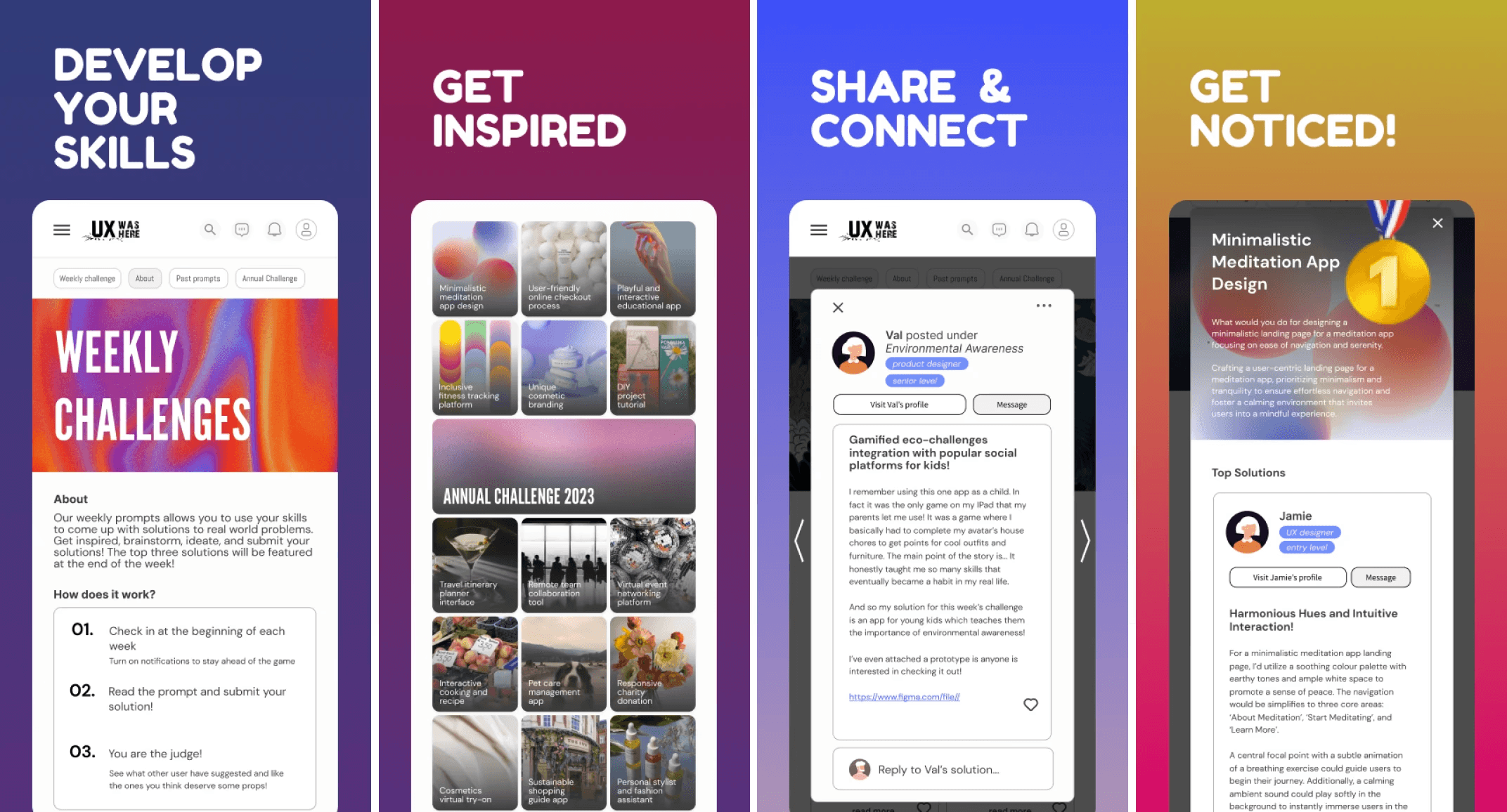
Our Solution(s):
Encuraging interaction to 'UX was Here' through mobile app features;
Weekly UX design challenges
Inspiration boards
Ability to share and receive feedback
Discover
Challenges and opportunities for current & future users.
Goals:
Explore how physical forms influence spatial reasoning in children
Translate historical design methods into playful, research-backed learning tools
To begin ideating, I first took a look at existing UwH users.

Posts with mentions of what current users wanted/wanted to achieve through the platform gave us an idea of what some of the current and potential future user goals were and how they were trying to attain them.

Using this information we shifted our focus on the goals and motivations of users, leading our direction for user research.
User Research
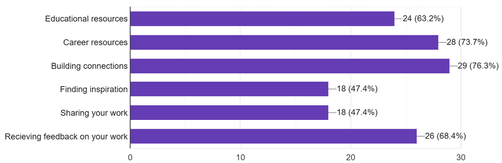
I collected user research through a short survey with 4 multiple choice questions, inquiring about participants career and educational goals and what resources would help achieve them.
Collected insights from 38 individuals helped gain a better idea of the features that would best help UwH address users' pain points.

Define
From data to insights
Research Foundations:
Study from Mind, Brain and Education: Block play helps children understand concepts like over, around, through
Survey Questions
Q: What are your current/future educational and career goals?
Asked to: Gauge what users may want from an app like UX was Here

Q: What would help you achieve your goal(s)?
Asked to: Understand what users are currently lacking, that can be targeted through new features
Q: What are some platforms that have been of help in achieving your goals?
Asked to: Gain inspiration for features through precedent research; other similar well known applications

Key Insight
Educational/career goals users wanted to achieve:

Key Insight
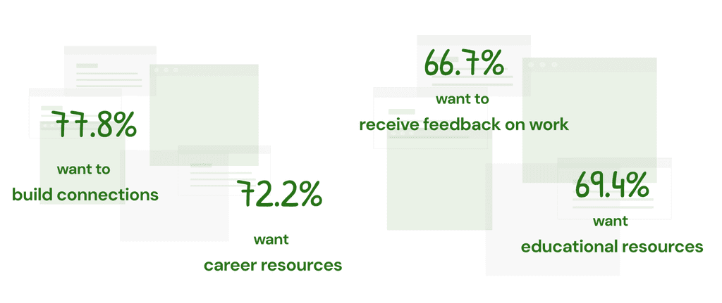
How users believed they'd achieve these goals:
Understand
User personas
Design References:
Alma Siedhoff-Buscher: Bauhaus designer known for her innovation of multi-functional furniture and children's toys.
Amedee Ozenfant: Cubist painter known for his still-life paintings of vase forms and founding the Purist art movement.
This user research helped in making four personas, to gain a better understanding of UwH’s current & potential future users.
Her blocks often featured:
Primary colors, known to support cognitive clarity in early childhood
Geometric shapes (cubes, arches, cylinders) that map intuitively to real-world structures
Balance between play and pedagogy, reflecting Bauhaus ideals of unifying art, design, and utility
I adopted these principles in my own prototype: limiting the color palette to red, blue, green, and white, and using simple geometric forms to avoid cognitive overload while promoting creative freedom.

Alma Siedhoff-Buscher, Kleine Schiffbauspiel ("Little ship-building game"). 1923
Amédée Ozenfant's cubist still life paintings were referenced to create the overall composition of my prototype. The compositions of his vases specifically inspired the sculptural form the blocks' final arrangement.
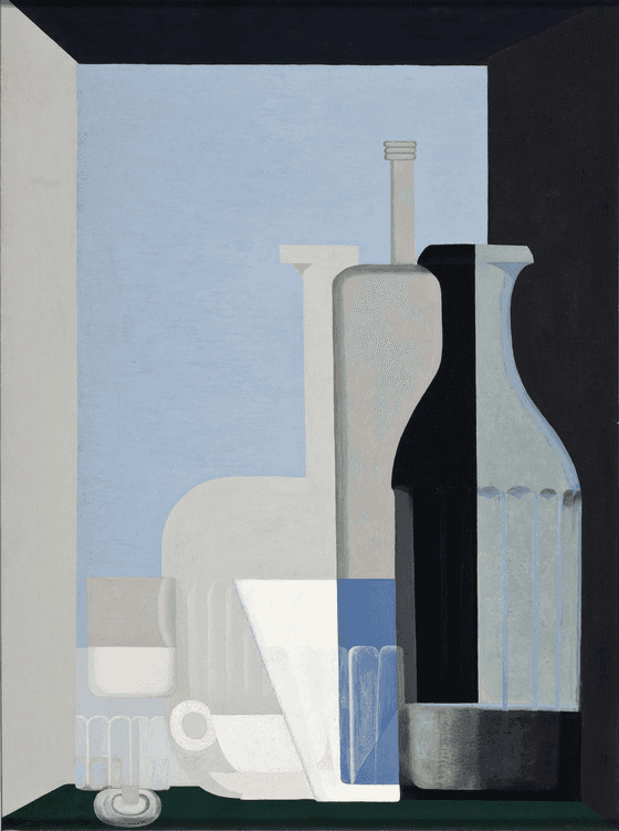
Amédée Ozenfant, Still Life with Bottles. 1922


Solutions
Solutions directly address some of the persistent pain points experienced by current and potential users.
Using precedent research, user research, & personas, we conceptualised a mobile application for UX was Here.
Solution 1
Improved Onboarding
Clarifying the goal of the 'UX was Here' app was central to our first solution. As it is a fairly new organisation, UX was Here has had a hard time honing in on specific features and identifying what sets it apart from its competitors.
By bringing these features to light and highlighting its uniqueness through the onboarding process, users will be able to understand and control their usage of the application much better.
Pain point:
Lack of value proposition & poor sign-up
Supported by:
Observations & competitor analysis
Solution:
Designing a clear & engaging onboarding process
By bringing these features to light and highlighting its uniqueness through the onboarding process, users will be able to understand and control their usage of the application much better.
Solution 2
Gamified UX
By introducing collaborative, game-style UX projects, users are able to challenge their UX skills while also creating a business opportunity for 'UX was Here' by inviting new users on to the app in order to participate.
Pain point:
UwH's need to differentiate & establish themselves as a platform
Supported by:
Competitor analysis & user research insights
Solution:
Unique interactive features; UX challenges
Solution 3
Inspiration & Feedback Board
Gain inspiration, share work, give & get feedback through UX was Here's third feature. A place for users to look through past challenge solutions, others' UX work, and share feedback in a positive, UX focused space.
Pain point:
UwH does not cater to what users wish to gain from it
Supported by:
User research insights & 'existing user' observations
Solution:
Address what current and potential users would want from the app; to gain inspiration, share work, give & get feedback
Constraints
Design in Space is a physical play prototype designed to support the development of children's spatial awareness.
Creative constraint breeds innovation: Using sponges unlocked unexpected possibilities and sped up iteration.
Designing for cognitive development requires intentional simplicity—every detail should support exploration.
This project deepened my understanding of how games and play-based learning can be informed by both design history and cognitive science.
What I Learned:
Designing for play requires balancing creativity with cognitive science
Constraints (e.g., time, materials) can lead to innovative, resourceful design methods
Historical design methods can meaningfully shape user-centered thinking, even in children’s play
What I’d Do Next:
Conduct observational playtests with children
Evaluate which spatial concepts are most clearly reinforced
Explore potential digital translation (e.g., block-based AR game or app)
Next Steps
Conduct observational play sessions with children to evaluate how they interact with the blocks.
Track which spatial concepts arise naturally during play.
Explore how this could be translated into a digital block-based app or AR experience, preserving tactility and open-ended play digitally.
Reflections
Out of 43 teams and nearly 200 participants, my team was selected as a winner.
This project was built in collaboration with client, UX was Here, a global UX platform founded by Matt Karakilic, during a hackathon-style design jam organised by Simon Fraser University, Eunoia UX 2024.
In just three days my team and I managed to conduct user research & synthesis, UI concepts & designs for individual screens, working prototypes, and a client-facing presentation.
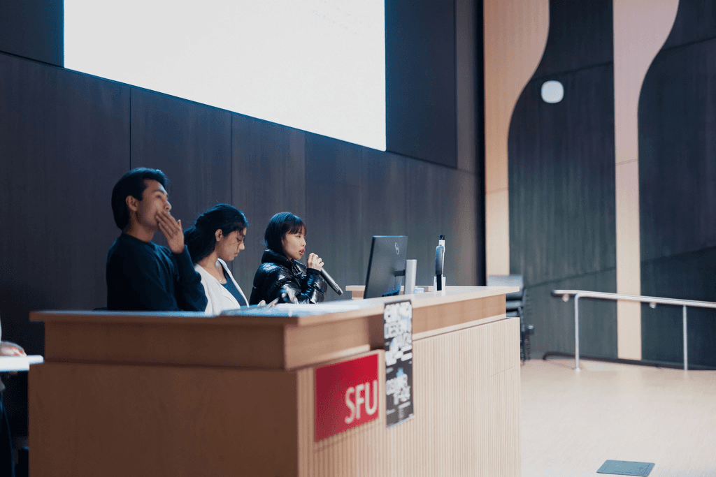
We had the chance to present our proposed solutions during Eunoia UX's closing ceremony in April 2024.
This experience was a challenging but rewarding opportunity to broaden my understanding of UX through business goals, and has helped me gain a better understanding of how to apply user research to craft solutions.

